

Key Takeaways
- Target a 2.5% to 4.0% Conversion Rate: In 2026, top-tier Shopify stores achieve mobile conversion rates within this window by minimizing friction in the checkout flow.
- Prioritize 1.5-Second Load Times: Mobile users abandon carts at a 40% higher rate if the Largest Contentful Paint (LCP) exceeds 1.5 seconds on a 5G connection.
- Implement One-Tap Payments: Enabling Shopify Payments with Shop Pay can increase checkout conversion by up to 50% compared to traditional guest checkouts on mobile devices.
- Optimize for the Thumb Zone: Place all primary call-to-action (CTA) buttons within the bottom 30% of the mobile screen to accommodate natural one-handed browsing habits.
The smartphone is no longer a secondary discovery tool; it is the primary transaction hub for the modern consumer. For Shopify merchants in 2026, a mobile-first strategy isn't about fitting a desktop site into a smaller window, but about engineering a frictionless, hand-held experience that respects the user's focus.
The Architecture of Mobile Speed
Speed is the silent killer of the Shopify mobile conversion rate. Every millisecond of latency between a product click and the page load erodes the buyer's confidence. On Shopify’s Online Store 2.0 framework, performance is heavily dictated by how you manage liquid assets and third-party scripts.
Technical Specs for Mobile Performance
| Metric | 2026 Benchmark | Shopify Action |
|---|---|---|
| Largest Contentful Paint (LCP) | < 1.5 Seconds | Use WebP/AVIF formats and lazy-load non-hero images |
| Interaction to Next Paint (INP) | < 200 ms | Minimize heavy JavaScript applications and tracking pixels |
| Hero Image File Size | < 150 KB | Use the Free Shopify Alt Text Generator for SEO-ready, lean assets |
| Theme Version | OS 2.0 | Ensure your theme uses JSON templates for modular loading |
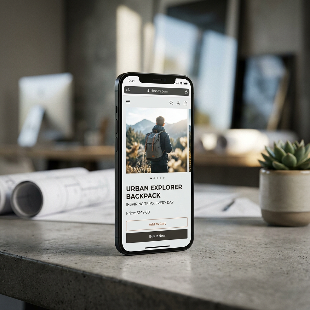
Minimizing App Bloat
Many merchants unknowingly degrade their mobile performance by stacking apps for rewards, social proof, and upsells. Each app adds a script that must execute before the page is interactive. Periodically audit your store using the Free Shopify Store SEO Checker to identify scripts that are delaying your mobile rendering and suppressing your conversion potential.
Designing for the Mobile Thumb
Mobile ergonomics dictate that users interact mostly with the bottom half of their screens. Desktop-centric designs often place critical navigation or "Add to Cart" buttons in the upper corners, which are difficult to reach during one-handed operation.
The Sticky CTA Strategy
Implementing a sticky "Add to Cart" button that stays anchored to the bottom of the viewport as the user scrolls ensures the conversion trigger is always within reach. This is particularly effective on long-form product pages where detailed specifications or reviews require extensive vertical scrolling.
Pro-Tip: Use CSS media queries to ensure your sticky CTA only triggers on screens smaller than 768px. This keeps the desktop experience clean while providing mobile users with a persistent path to purchase.
Mobile-First Navigation Menus
In 2026, mega-menus are a desktop relic. Mobile navigation should be hierarchical and icon-driven. Instead of a text-heavy sidebar, use a "thumb-friendly" bottom navigation bar for your most important categories: Home, Search, Cart, and Account. This mimics the UI of native iOS and Android apps, creating a sense of familiarity and ease.
Frictionless Mobile Checkout
The gap between "Add to Cart" and "Order Confirmed" is where most Shopify mobile conversion rate leakage occurs. Typing credit card numbers on a virtual keyboard is a high-friction activity that leads to abandonment.
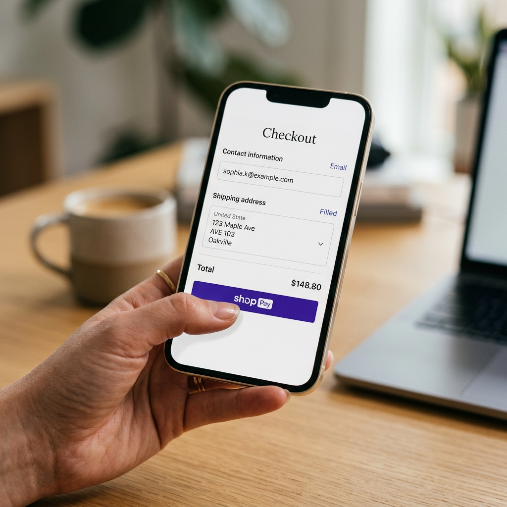
Accelerated Payment Methods
Shopify Payments remains the most powerful tool for mobile merchants. By integrating Shop Pay, Apple Pay, and Google Pay, you allow users to bypass forms entirely. These systems use biometric authentication (FaceID or Fingerprint) to confirm shipping and billing instantly. When calculating your true margins using the Free Shopify Fee Calculator, factor in how these accelerated methods reduce the cost of customer acquisition by lifting the conversion ceiling.
Eliminating Header and Footer Distractions
Once a user enters the checkout phase, remove the main header navigation and the site footer. The only links available should be your logo (to return home) and the legal requirements (Privacy Policy, Terms of Service). This "tunnel vision" design keeps the user focused on the singular goal: completing the transaction.
Content Hierarchy on Small Screens
Mobile users scan content rather than reading it. If your product descriptions are dense blocks of text, you will lose the buyer's interest before they find the value proposition.
Scannable Product Information
Use bullet points for technical specs and short, punchy paragraphs for brand storytelling. If you find your current descriptions are too desktop-heavy, use the Free Shopify Product Description Generator to refactor your copy into a mobile-optimized format that highlights benefits over features.
Comparison: Mobile vs. Desktop UX Priorities
| Feature | Mobile Priority | Desktop Priority |
|---|---|---|
| Navigation | Bottom-drawer / Hamburger | Top horizontal / Mega-menu |
| Images | Vertical (4:5) or Square (1:1) | Landscape (16:9) |
| Forms | Single-column, auto-fill enabled | Multi-column, detailed layout |
| Search | High-prominence icon / bar | Integrated in header with filters |
Conclusion
Optimizing your Shopify mobile conversion rate in 2026 requires a shift from decorative design to functional engineering. By prioritizing speed, ergonomics, and accelerated checkouts, you transform your mobile store from a mere gallery into a high-performance sales engine. Small adjustments to your Liquid code and asset management can yield significant dividends in your bottom-line profitability.
Audit your mobile performance today using our Free Shopify Store SEO Checker to find immediate opportunities for growth.
Frequently Asked Questions
What is a good mobile conversion rate for Shopify in 2026?
A healthy mobile conversion rate typically ranges from 2% to 4%. However, this varies by industry; luxury goods may see lower rates with higher average order values, while FMCG brands often see much higher mobile engagement.
Does Shopify calculate mobile conversion rate separately?
Yes, in your Shopify Analytics dashboard, you can filter the 'Online store conversion rate' report by 'Device Type' to see a specific breakdown for mobile, tablet, and desktop.
How does page speed impact mobile conversion?
Page speed is a primary conversion factor. Research shows that for every second of delay in mobile load time, conversions can drop by up to 20% due to user frustration and increased bounce rates.
Should I use a separate mobile theme for Shopify?
No. Modern Shopify Online Store 2.0 themes are natively responsive. Using a single responsive theme ensures SEO consistency and easier maintenance than managing two separate versions of your site.