
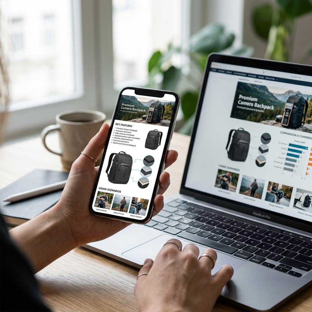
Mobile shopping apps now account for more than 80% of Amazon’s total traffic as of mid-2026. Sellers who treat mobile optimization as an afterthought are effectively showing a broken store to four out of five potential customers. Success in the current marketplace requires a radical shift toward mobile-first asset production rather than simple desktop downsizing.
The Mobile Reality Check for Amazon Brand Registry
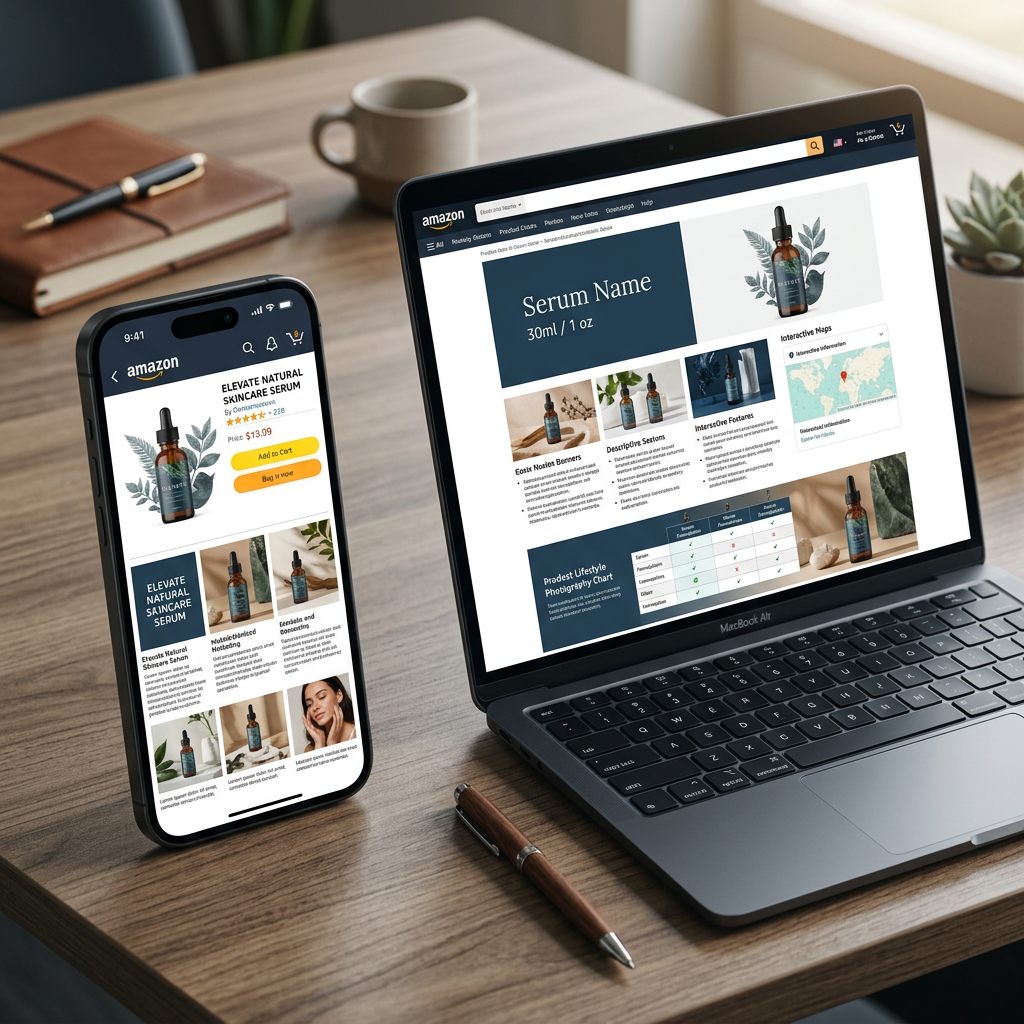
In 2026, the Amazon mobile app renders A+ Content differently than the desktop browser experience. On desktop, users see horizontal modules that span the width of the screen. On mobile, these same modules are stacked vertically and significantly shrunk to fit narrow aspect ratios. If your design relies on small text embedded within images, it will become illegible on a 6-inch smartphone screen.
Amazon's algorithm also prioritizes lean, fast-loading listings. Heavy, unoptimized image files can lead to "layout shift" on the mobile app, causing customers to bounce before the story even loads. Before investing in heavy design work, use a free Amazon Listing Analyzer to ensure your foundational metadata is strong enough to justify the A+ traffic.
Critical Readability Standards for 2026
To pass the squint test on a mobile device, your typography must be bold and high-contrast. Avoid using thin, elegant fonts for technical specifications. Instead, use sans-serif fonts with a minimum size equivalent to 16pt after scaling. Every module should serve a singular purpose: one product feature, one lifestyle benefit, or one technical specification.
Mobile-First Image Scaling and Aspect Ratios
The standard 970 x 600 pixel module is the workhorse of A+ Content, but it is prone to scaling issues. When optimized for mobile, these horizontal images become quite short, requiring the user to scroll frequently. Many successful sellers are now utilizing the "Standard Image & Dark/Light Overlays" or shifting toward Premium A+ Content for higher conversion, which offers full-width video and larger imagery that handles mobile responsiveness more gracefully.
Tip: Always export your mobile-specific assets at 2x resolution. While Amazon will compress them, starting with high-dpi assets prevents the "blurry text" look on Retina and OLED mobile displays common in 2026 hardware.
| Feature | Desktop Experience | Mobile App Experience |
|---|---|---|
| Layout | Horizontal/Side-by-Side | Perpendicular Vertical Stack |
| Text Legibility | High (even for small fonts) | Low (embedded text must be 2x size) |
| Comparison Tables | Full Grid View | Horizontal Swipe or Shrink-to-Fit |
| Key CTA | Visible above the fold | Requiring significant scroll |
Comparison Charts on Mobile: The Conversion Killer
The comparison chart is one of the most powerful modules for cross-selling within your brand. However, on the Amazon app, these charts often compress into unreadable columns. To fix this, limit your comparison charts to three or four products maximum. Ensure the product thumbnails are high-contrast and the identifying text is brief—ideally just the model name and one key differentiator.
 For brands managing dozens of SKUs, it's better to create a curated experience. Link to your most popular variations or complementary items rather than a comprehensive catalog. This reduces cognitive load and keeps the mobile shopper focused on the purchase. If you are struggling with the copywriting for these sections, the free Amazon Description Generator can help structure your feature-benefit pairs for maximum scannability.
Technical Specs for 2026 Mobile Assets
When designing your assets, refer to the 2026 Amazon A+ Content image size guide to ensure your base files are future-proof. While Amazon allows for JPG and PNG, PNG-24 is preferred for any graphics containing text or flat illustrations to prevent artifacting around the letters when viewed on high-clarity mobile screens.
The "Golden Ratio" for Mobile Copy
- Headline: 4-6 words maximum. This should be the core benefit (e.g., "Waterproof Up to 50 Meters").
- Body Text: 2-3 short sentences. Mobile users do not read; they scan.
- Visual Hierarchy: The image should communicate the benefit even if the text is ignored. Use icons and callouts.
- Backend Keywords: Don't forget that mobile A+ image alt-text is indexed by search engines. Use the free Amazon Keyword Research tool to find high-intent terms to embed in your image metadata.
Vertical Stacking and User Flow
On a smartphone, your A+ modules appear as a continuous vertical scroll. This allows you to build a narrative. Start with an aspirational lifestyle image to build emotional connection, followed by a technical deep-dive, and finally a comparison chart to prevent the user from leaving your listing to check a competitor.
For specialized niches, such as health and wellness, ensure you are following Amazon A+ content compliance for supplements while maintaining this visual flow. FDA disclaimers and ingredient lists must be perfectly legible on mobile to maintain consumer trust and platform compliance.
Optimizing for the 2026 Amazon Algorithm
Amazon's A10 algorithm (and its 2026 iterations) tracks mobile engagement metrics like "dwell time" and "interaction rate" on A+ modules. If users quickly scroll past your content without stopping, it signals to Amazon that the content is not relevant. High-quality, mobile-optimized visuals force a "thumb stop," increasing the time spent on your Detail Page, which correlates with higher organic ranking.
If your conversion rates are lagging despite high-quality A+, evaluate your price-to-value proposition. Use a free Amazon PPC Bid Calculator to determine if your current advertising spend is aligned with the conversion lift you are gaining from your mobile-optimized A+ designs.
Conclusion
Amazon A+ content mobile optimization is no longer a luxury; it is the baseline for competitive selling in 2026. By prioritizing large text, high-contrast imagery, and vertical-flow layouts, you ensure that your brand story remains impactful on every screen size. Monitor your mobile-specific conversion rates in Seller Central and adjust your module order based on where customers are dropping off.
To see how your current content ranks against top competitors, run your ASIN through the ListerRank free Amazon Listing Analyzer today.
Frequently Asked Questions
Does Amazon allow different A+ Content versions for mobile and desktop?
No, Amazon uses a single A+ Content submission that scales responsively. You must design one set of modules that works effectively on both, which is why a mobile-first approach is recommended.
What is the best image resolution for A+ Content in 2026?
While the standard width is 970 pixels, exporting your designs at 1940 pixels wide (2x) ensures that images look sharp on high-density mobile displays used in 2026.
Will mobile-optimized A+ Content help my SEO?
Yes. Image alt-text in A+ Content is indexed, and higher engagement/dwell time from mobile shoppers signals quality to the Amazon algorithm, potentially boosting your search rankings.
How many modules should I use for a mobile-friendly listing?
Aim for 5 to 7 modules. Too few leaves the customer with questions; too many creates a 'wall of content' that mobile users may find exhausting to scroll through.